My Perception of Stelae
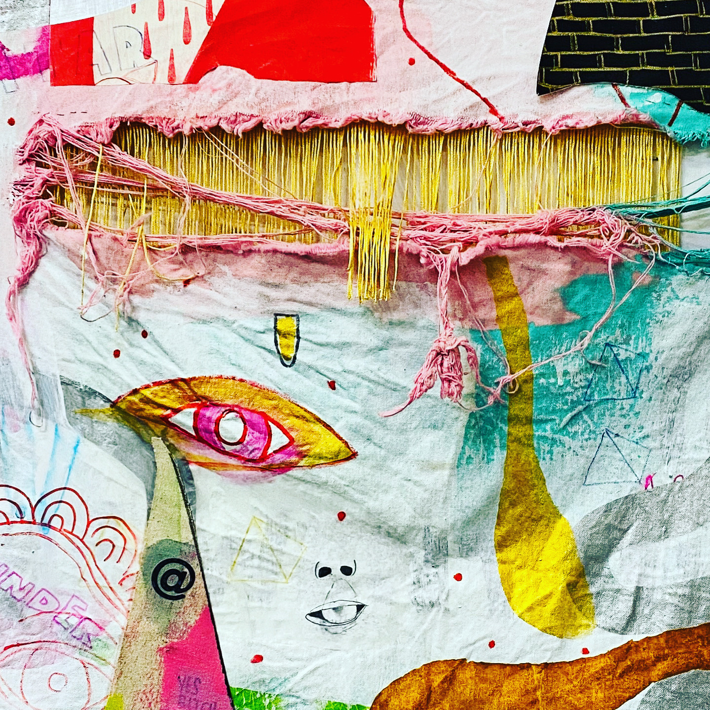
Previously within my Freshman and Sophomore years at Loyola, I worked as a Desk Assistant at the Julio Fine Arts Gallery. There isn't a time I can recall in which an exhibition was as vibrantly colored as the gallery is through Stelae. Before the exhibition was finalized, I had the opportunity of assisting René Treviño in completing the pink wall where flies are scattered. In retrospect, my interaction with the artist allowed me to make parallels of his work to his personality. While it may seem cliche, I found that René's personality was quite colorful as well, despite me not previously meeting him. In a sense, that is the feeling his exhibition resembles-how the use of vibrant and unexpected colors allows visitors to feel welcome in an unknown place. Additionally, the pastel colors used which contrast to gold and black light up the gallery, proving a point that color can affect our mood.
My favorite aspect of the Stelae exhibition is the pink wall, due to the way it highlights the pinks and golds within other pieces. With the flies, it is evident that René required a strict level of precision in executing the idea as well as hanging the entire piece(s) on the wall. The fact of how organized the flies look in relation to each other is another reason why I enjoyed looking at the wall. Placing the flies as a backdrop also helps in accentuating the five pieces placed within the flies. These five pieces to me resemble a dia de los muertos skull, because of the color and intricate designs.
- Emily Morvey, Class of 2020

Comments
Post a Comment